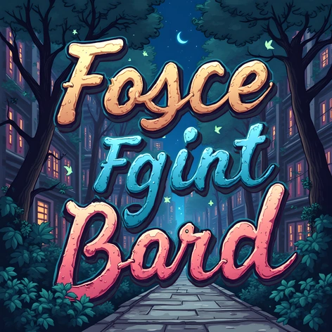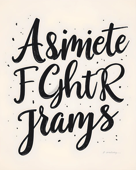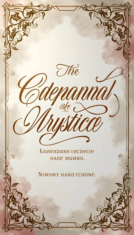
equalize font
Resize and add details
Convert to video
Outpaint the rest of the image
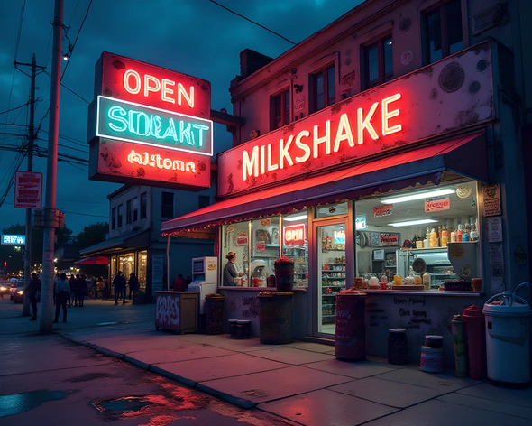
Additional Info
ModelFlux
Seed457238047
Enhanced Promptfont equalization, sans-serif typography, modern aesthetic, pixel-perfect rendering, high-resolution display, screen-friendly design, clear readability, legible text, consistent line spacing, font size between 12pt and 14pt, monospaced font, fixed-width layout, subtle anti-aliasing, minimal kerning, bold headings and subheadings, italicized emphasis, serif font for titles, sans-serif font for main content, font weight ranging from light to extra-bold, font styles including regular, italic, bold, and bold italic, font family consisting of Open Sans, Lato, Montserrat, and Raleway, font sizes varying between 10pt and 24pt, text alignment justified or left-aligned, font color palette featuring a mix of primary colors, secondary colors, and neutral shades, color scheme based on a balance of warm and cool tones, font pairing strategy combining two or three fonts per design element, carefully selected font combinations for maximum visual harmony, font hierarchy clearly defined, heading font size ranging from 18pt to 36pt, heading font weight ranging from light to extra-bold, heading font styles including regular, italic, bold, and bold italic, heading font family consisting of Playfair Display, Great Vibes, Pacifico, and Dancing Script, heading font sizes varying between 14pt and 28pt, heading text alignment centered or left-aligned, heading font color contrasting with main content, font size adjustment for accessibility, clear and concise font labels, easy-to-read font sizes for small screens, accessible font sizes for large screens, adaptable font sizes for print materials, scalable font sizes for digital displays, optimal font sizes for various devices and platforms, inclusive font sizes catering to diverse user needs, accessible font sizes ensuring readability across different contexts, responsive font sizes accommodating changing screen resolutions, adjustable font sizes for users with disabilities, font sizes prioritizing readability and usability, well-designed font hierarchies promoting effective communication, typography guidelines adhering to industry standards, font sizes optimized for information density and comprehension, typography systems balancing aesthetics and functionality, harmonious font combinations fostering brand recognition, visually appealing font pairings enhancing user engagement, expertly crafted font selection processes ensuring consistency and coherence, typefaces chosen for their versatility and adaptability, careful consideration given to font legibility and readability, thoughtful approach to font choice and application, attention to detail in font implementation and execution, high-quality font renderings guaranteeing professional-grade results, precise control over font metrics and typographic settings, thorough testing and quality assurance for font performance and appearance, continuous evaluation and refinement of font choices, ongoing assessment of font effectiveness and impact, iterative improvements to font selection and deployment, collaboration with experts to ensure