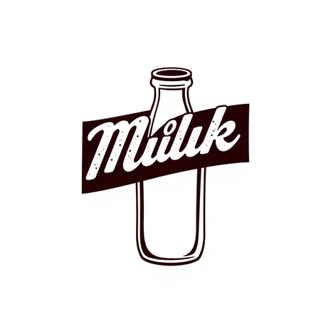
got milk font
Resize and add details
Convert to video
Outpaint the rest of the image
Additional Info
Steps36
Samplerddim
CFG Scale8.9
Seed588415563
Enhanced PromptGot Milk font, playful typography, bold black letters, white background, distressed texture, vintage style, reminiscent of 1990s advertising, iconic font designed by Jeff Manning and Art Director Stan Fiorito, originally created for California Milk Processor Board's advertising campaign, distinctive lettering with irregular shapes and subtle wear, giving it a worn and retro aesthetic, font style often associated with bold statements and eye-catching graphics, widely recognized and often parodied, nostalgic value for those who grew up with the campaign, simple yet effective design, easily readable and memorable, often used in advertising and graphic design to convey a sense of fun and playfulness, distressed texture adds a tactile quality, suggesting a worn and weathered look, as if the font has been aged to perfection, a true classic of American advertising, instantly recognizable and synonymous with the Got Milk brand, a testament to the power of typography in branding and advertising, a font that has become an integral part of pop culture, continuing to inspire designers and advertisers alike, a timeless design that remains fresh and relevant today.